The manner in which we shape our letters when we write influences others’ perceptions regarding our personality, providing a visual cue about who we are. Just as this holds true for people, it also applies to brands, regarding the distinctive personality and character which makes them unique.
As all brands have the essential objective of establishing a connection with their audiences, their choice and use of typography is key. As part of our brand evolution at Santander, we have crafted our own distinctive typographic font which will allow us to do precisely that: allow us to connect better with people.
The journey to our new typography
In 2018, we embraced a clear mandate in our strategy for engagement with our audiences: to evidence the cultural and digital transformation coming to life throughout our entire organisation at a global level. We recognised this as something which necessary to convey in our brand expression visually and graphically.
This led to a thorough re-branding in which all of our Group’s country markets have participated.
We worked on the evolution of our brand’s visual identity expression, revitalising our logo, tone of voice and, of course, our typographic style. This is why and how our brand wordmark; our flame symbol and typographic style have evolved. An evolution that offers an optimised visual manifestation of our culture and ‘how we do things’: in a manner that’s Simple Personal and Fair.
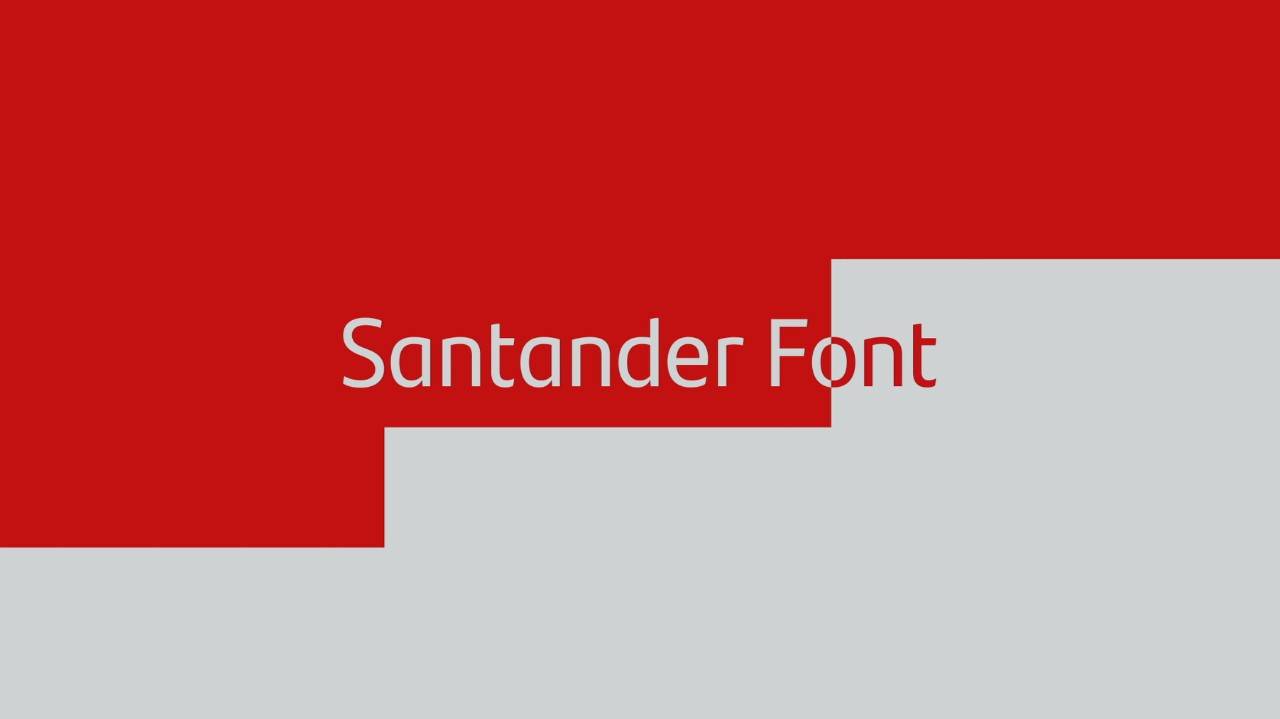
In April of 2019 we introduced our new Santander Font, hand-crafted by internationally renowned typographic experts, Monotype. It’s a typography which is fresh, elegant and straightforward. It has been carefully designed not only to help us face future challenges, but is also more flexible and digital to accommodate its application easily and naturally in both physical environments and digital environments.